Project Name: MedTrigg
Role: UX Researcher, UI Designer
I worked on this project alone as a part of Google UX Design Certificate Program.
Duration: August 2021 to September 2021
Project
MedTrigg is a medication reminder app focused on reminding users to take their medicine. MedTrigg ’ primary target users include young adult and adults who are concerned about their health and would like a reminder that could help them take their medication without missing doses.
Objective
The aim is to design an experience that would help people and their loved ones in remembering to take their medication at the appointed time and creating a minimalistic UI while keeping users as the main focus.
User research: summary
I conducted interviews and created user journey maps to understand the users I’m designing for and their needs. A primary user group identified through research was young and working adults who keeps forgetting to take their medication on time The feedback received through research made it very clear that users would be happy if they had access to an easy to use tool that would remind them before medication and at the exact time to take their medicines.
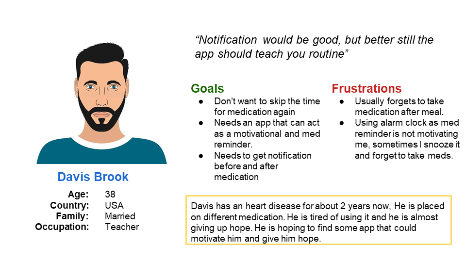
Meet one of the personas
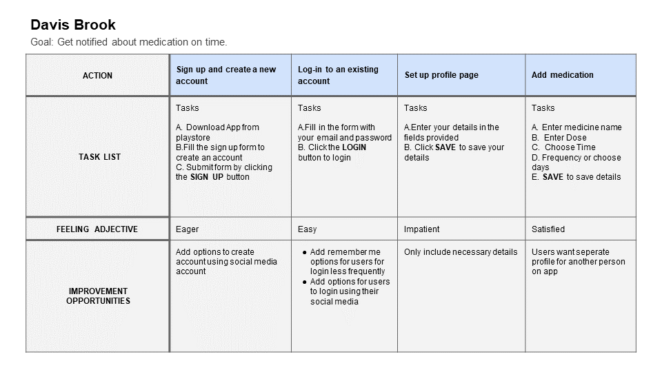
User Journey Map
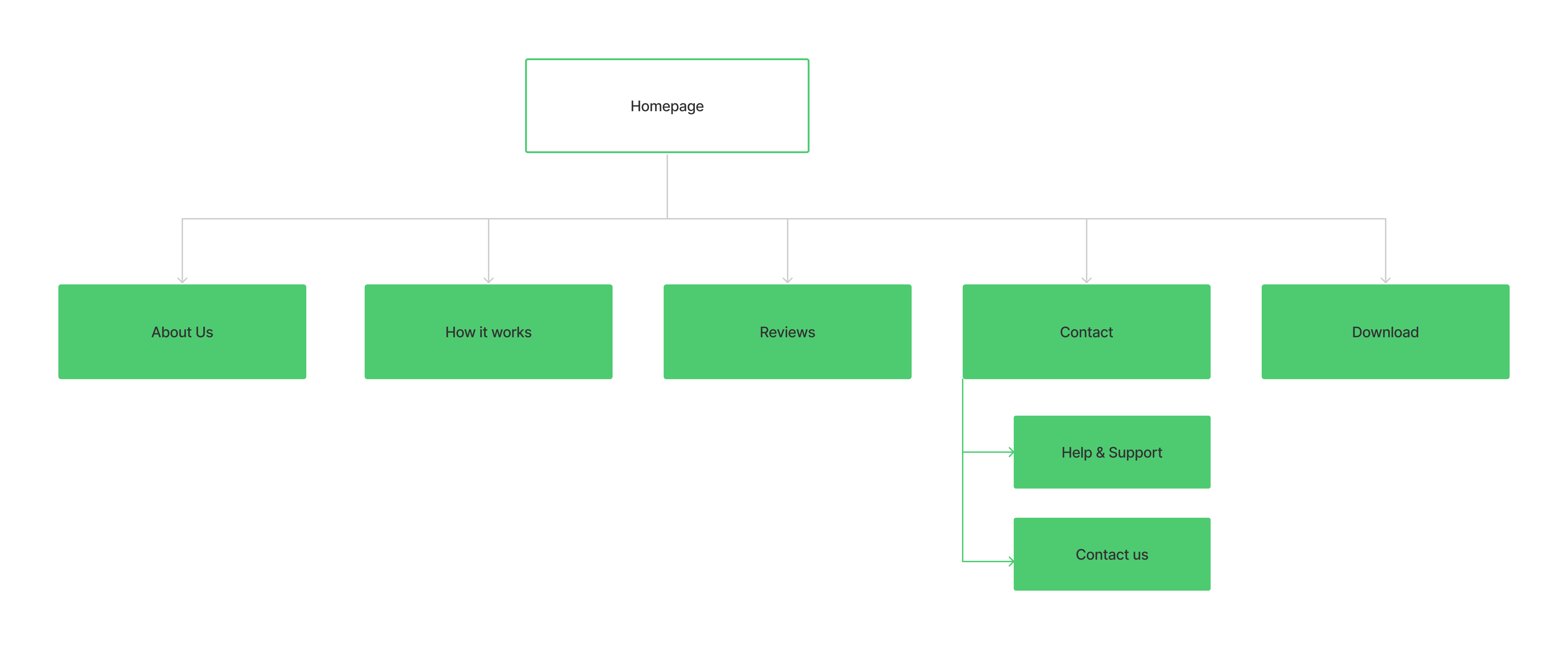
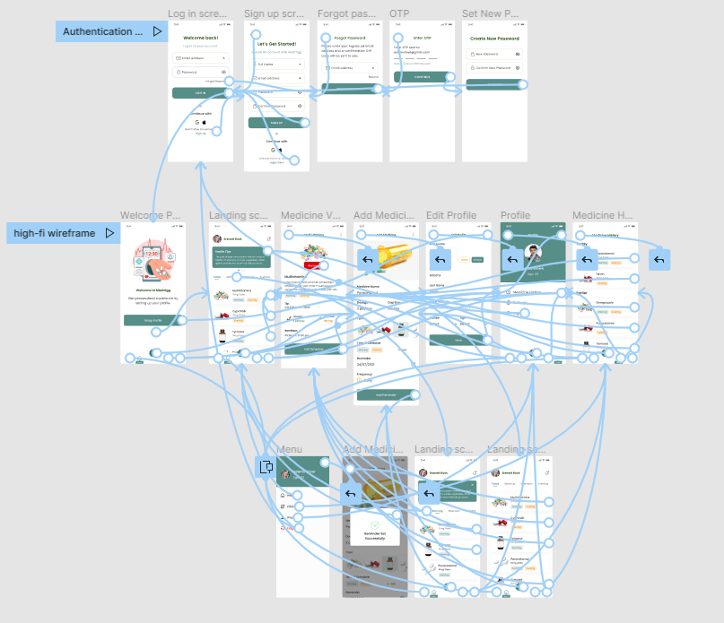
Site Map
Site Map After understanding the pain points and putting down the features which would increase the user engagement
and meet the users’ expectations, I designed the information architecture. This helped me organize and create the
overall structure for the website.
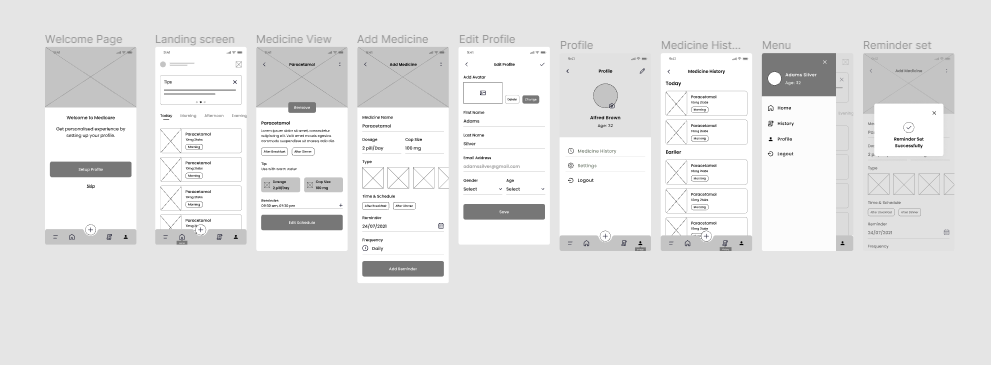
Digital Wireframe
Using Figma, I built a low-fidelity wireframe for the responsive website.
Mockups
By testing the lo-fi prototype through a usability study, It appeared that I'm ready to move forward
with the process and start drawing my mockups for the main user flow of the website so that I can turn them later into a working
prototype.
Now the design really begins to take shape: actual text is used, colors are applied, and images are added. This mockup shows a visual that gives a better idea of the final design.
Iteration
After creating the mockup, a usability study was conducted to figure out how easy and intuitive it is to complete the user flow of the app.
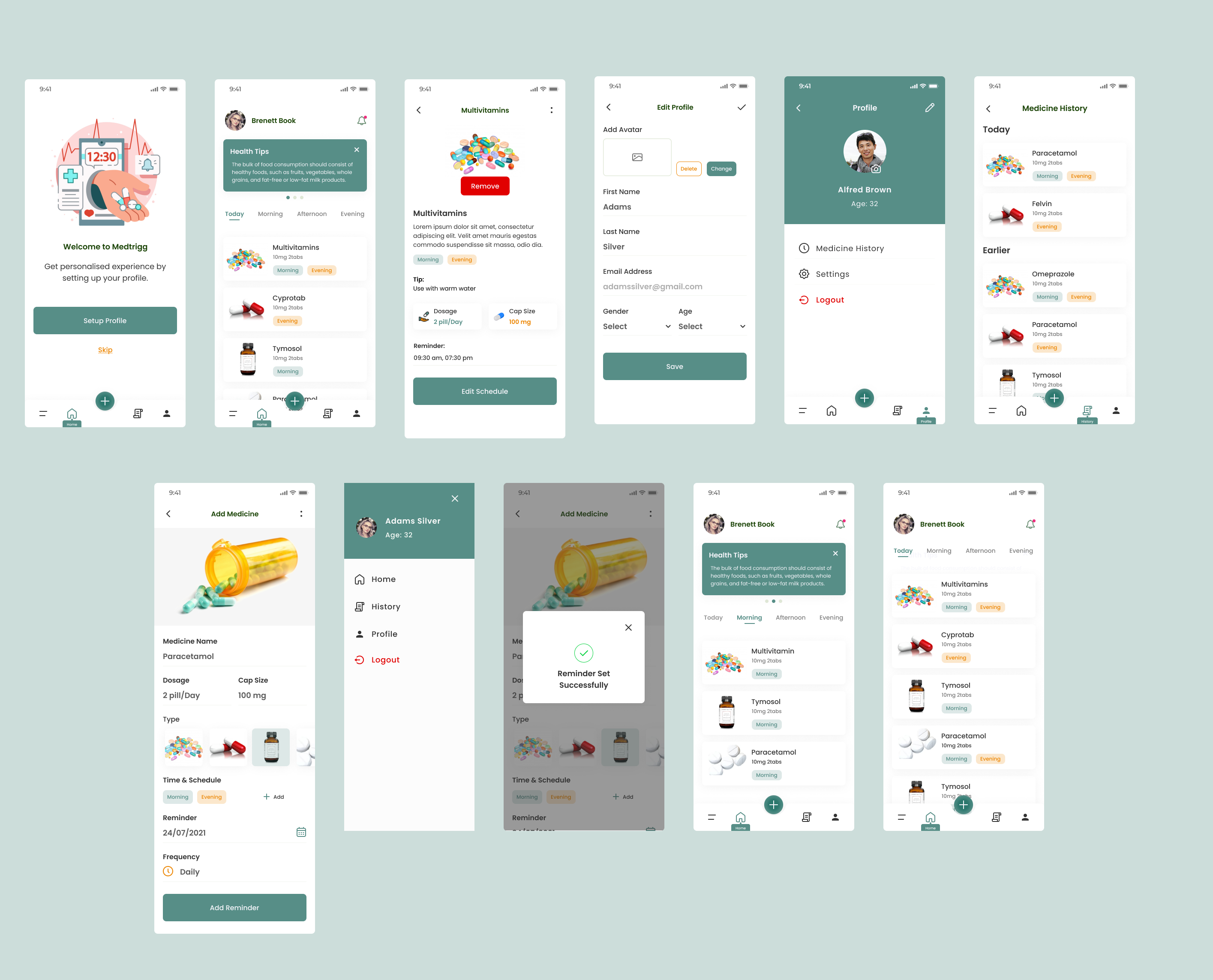
The final polished design
The main flow of the app is fully developed and gives a complete picture of the app's main task which is adding medicine schedule.
It addresses the user’s needs for a simple, yet engaging and uncluttered design.
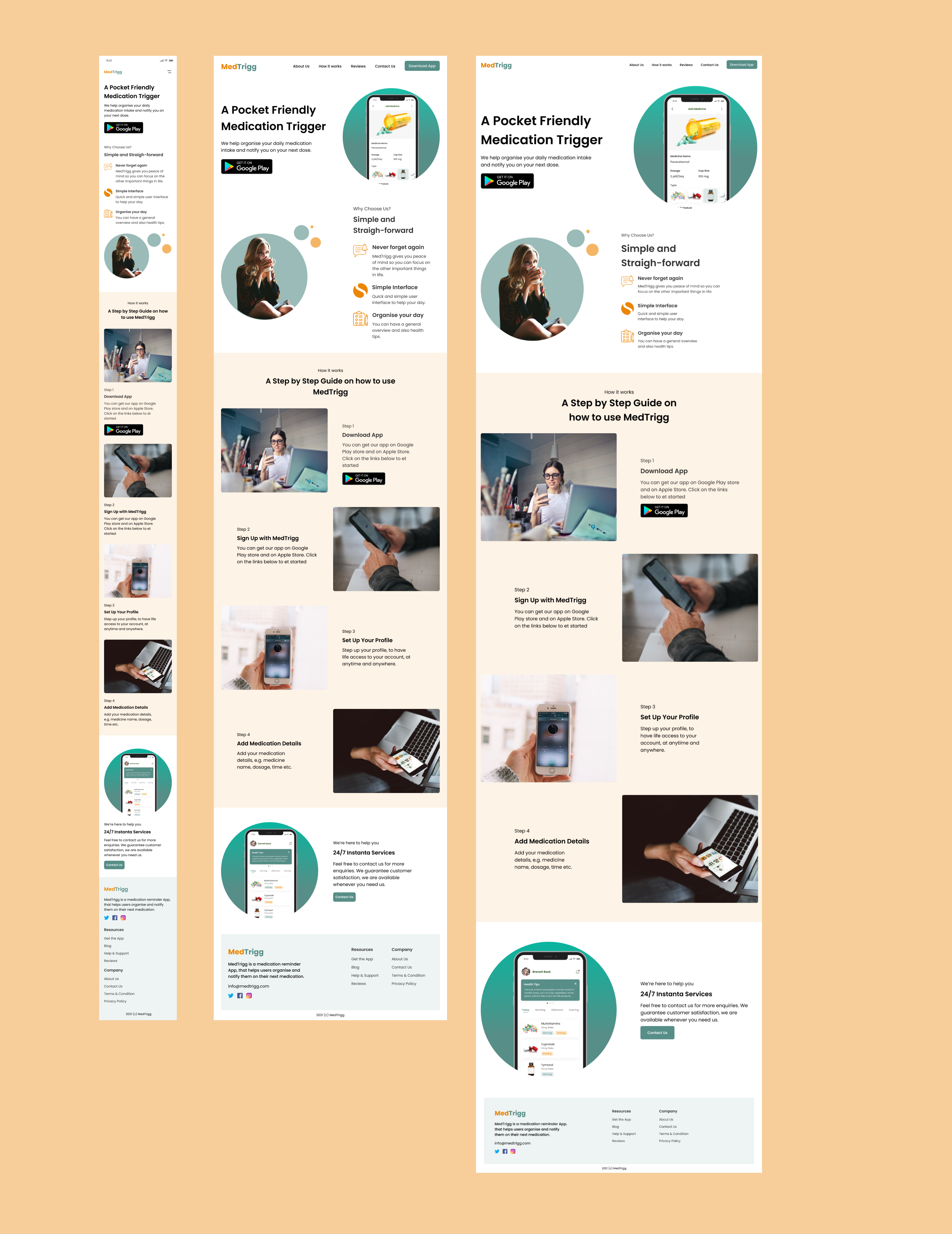
Responsive Website
The designs for screen size variation included mobile, tablet, and desktop. I optimized the designs to fit specific user needs of each device and screen size.
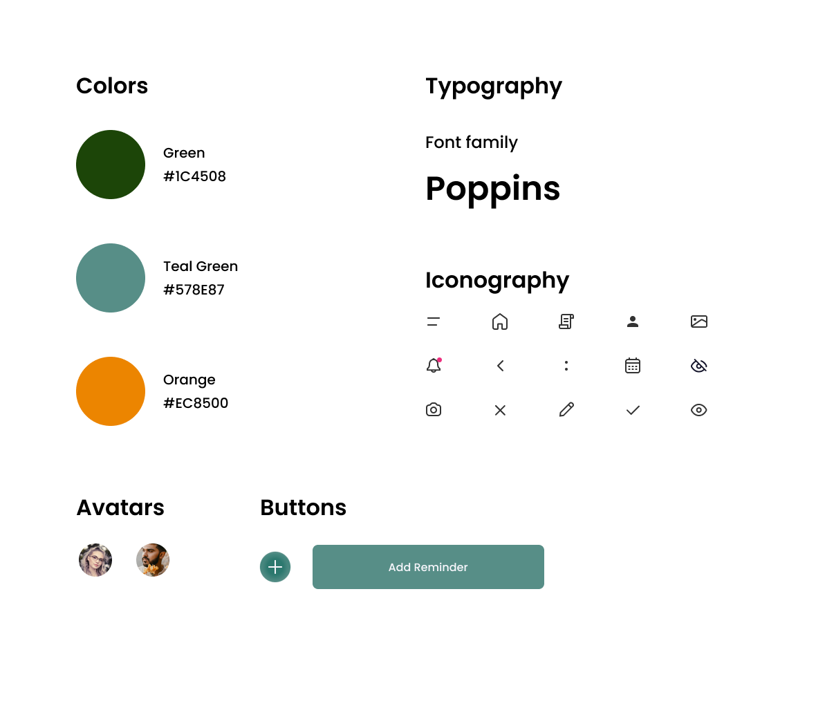
Sticker Sheet
It was really handy saving all the resources including colors, fonts, and font sizes to reuse them easily across the different parts of the website.
it was also useful to save components like icons, navigation bar, and footer instead
of recreating them every time they’re needed.
Takeaway
I learned that even though the problem I was trying to solve was a big one, diligently going through each step of the design process and aligning with specific user needs helped me come up with solutions that were both feasible and useful.
Accessibility Considerations
Used icons to help make navigation easier.
Clear labels for interactive elements that can be read by screen readers.
Initial focus of the home screen on personalized recommendations help define the primary task or action for the user.
To view the complete case study please visit the process deck
Process Deck