eFinder Responsive Website
Project Name: eFinder
Role: UX Researcher, UI Designer
I worked on this project alone as a part of Google UX Design Certificate Program.
Duration: June 2021 to August 2021
Project
eFinder is a study partner request flow responsive website that provides assistance with finding Study partners for an online design students who wish to finder study partner in their field. The product focuses on delivering an easy and intuitive user-flow, as well as a simple, quick, and clear request procedure.
Objective
The aim is to design an experience that would easily connect designers to a suitable study partner by providing them an easy request flow. Designing this process helps to save time and frustration in trying to find a good study partner.
User research: summary
I conducted user interviews, which I then turned into empathy maps to better understand the target user and their needs. I discovered that many target users are having issues in finding a study partner that fit their needs. However, many designers feels intimidated and confused when interacting with senior designers during a conference or social gathering. This caused a normally enjoyable experience to become challenging for them, defeating the purpose of aiming high.
Pain point
Difficulty in finding partner with the same zeal & commitment.
Pain point
Getting a communities where designers is not forthcoming.
Pain point
Getting a communities where designers is not forthcoming.Meeting up with the standard as a designer is an headache.
Pain point
Always distracted when studying alone.
Meet Daisy
.png)
Daisy User Journey
.png)
Site Map
Site Map After understanding the pain points and putting down the features which would increase the user engagement
and meet the users’ expectations, I designed the information architecture. This helped me organize and create the
overall structure for the website.
Paper Wireframe
After defining the problem and user research, the next step involves design planning. In this phase,
I sketched out ideas and built a wireframe task flow that solves users’ requirements.
Digital Wireframe
Then Using Adobe XD, I built a low-fidelity wireframe for the responsive website.
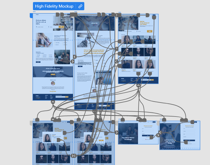
Mockups
By testing the lo-fi prototype through a usability study, It appeared that I'm ready to move forward
with the process and start drawing my mockups for the main user flow of the website so that I can turn them later into a working
prototype.
Now the design really begins to take shape: actual text is used, colors are applied, and images are added. This mockup shows a visual that gives a better idea of the final design.
Iteration
While testing the mockups, it turned out that the filter menu on the search results screen was not added, so before proceeding to the prototype I made sure it was included.
The final polished design
The main flow of the website is fully developed and gives a complete picture of the website’s main task which is adopting a pet.
It addresses the user’s needs for a simple, yet engaging and uncluttered design.
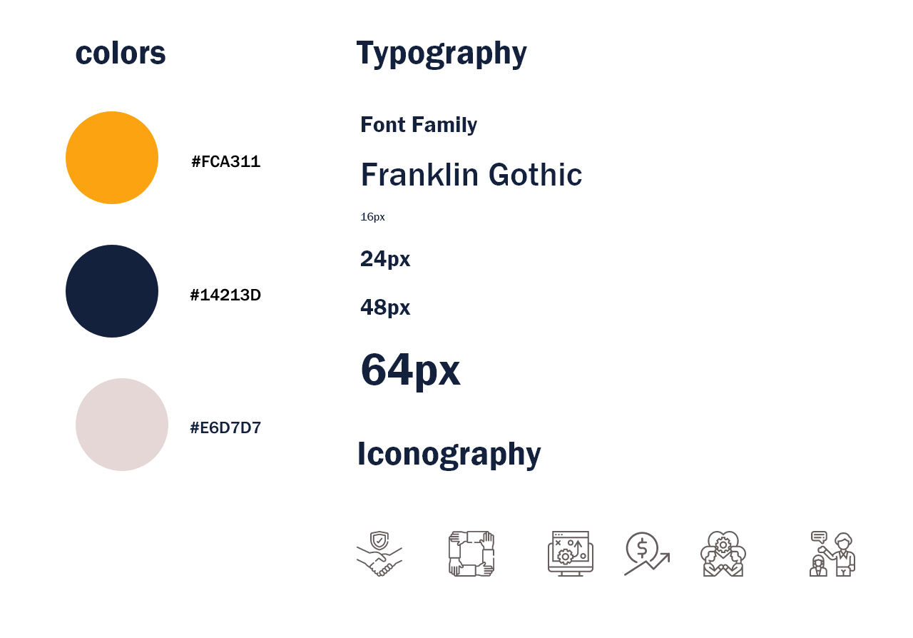
Sticker Sheet
It was really handy saving all the resources including colors, fonts, and font sizes to reuse them easily across the different parts of the website.
it was also useful to save components like icons, navigation bar, and footer instead
of recreating them every time they’re needed.
Takeaway
I learned that even a small design change can have a huge impact on the user experience. The most important takeaway for me is to always focus on the real needs of the user when coming up with design ideas and solutions.
Accessibility Considerations
I used headings with different sized text for clear visual hierarchy
I designed the site with alt text available on each page for smooth screen reader access
I used landmarks to help users navigate the site, including users who rely on assistive technologies
To view the complete case study please visit the process deck
Process Deck